
Support Hub
Support Hub

This section contains blocks that help stylise your content such as the Button Block, Columns Block, More Block, Page Break Block etc..
NOTE: As of version 5.4 onwards, the block editor introduced new blocks, including deprecating the Button Block in place of a Buttons Block. How to use this replacement is detailed beneath this one.
The Button Block allows you to easily add buttons with HTML links into your content.
Once you’ve added your content to your block, there are further options available in the Settings Sidebar. You have the choice of a number of different styles for your buttons along with selecting the button colour and the text colour.
To add or edit the text on your button, simply click on the button and type your button text. Just under the button is an input field where you can enter the URL for your button link.
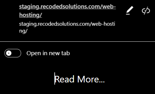
WordPress 5.4 introduces the Buttons block which will replace the Button block. As you can guess from the name of the new block, it allows you to add multiple buttons side by side.
You can select the background or gradient colors for each button and choose from two different styles.
The Columns Block allows you to insert a row with multiple columns. After adding a Columns Block, you’re then able to add whatever blocks you want, into those columns. The Columns Block is useful for making more interesting layouts with your content, rather than the typical single column of text that the Classic Editor allowed for.
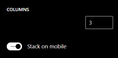
You can select the number of columns within the Columns Block using the slider in the Settings Sidebar.
The Group Block provides a way of grouping multiple blocks together. This can be handy if you want to add some custom styles to a certain section of blocks within your page, or even if you simply want to add a background colour to a group of multiple blocks. After adding a Group Block, you’re then able to add whatever blocks you want, into this block.
Once you’ve added your content to your block, there are further options available in the Settings Sidebar such as being able to select the background colour for your group of blocks.

The Media & Text Block provides and easy way to add a two-column layout consisting of text content and a media file, such as an image or video. You have the choice of showing the media on the right or on the left by using the Show media on left () or the Show media on right () icons located on the Block Toolbar. The text content can only consist of Paragraph, Heading, List or Button Blocks.
Once you’ve added your content to your block, there is an option in the Settings Sidebar to choose whether you would like the content stacked when viewed on smaller devices (i.e. media on top of content or vice-versa, depending on the layout you’ve chosen).
The More Block allows you to add a More Tag to your content. Most archive pages (e.g your blog page) only display a small excerpt of a Post and then provide you with a “Read more…” link to continue reading the rest of the article. When you insert a More Block into your content, everything prior to the tag is considered as this excerpt. Most times you’d only use this button when you’re creating a blog Post, rather than a Page.
You can only insert one More Block into each Page or Post. If you’d like to change the text in your “Read more…” link, simply click the text within the block and change it to whatever you’d like to display. To revert back to the default text that your theme displays, simply remove all the text from the block and save your Post or Page.
The Page Break Block allows you to break your content up into multiple pages. This is ideal if your page has a large amount of content. After adding a Page Break Block, your published content will show navigation links for each of the pages.
The Separator Block allows you to add a horizontal separator into your content. Separators represent a thematic break between paragraphs and are typically used when you’re changing the scene in a story or switching topics in your content.
Once you’ve added your Separator Block, you can use the Styles panel in the Settings Sidebar to change the look of the Separator.
The Spacer Block allows you to add white space between blocks.
Once you’ve added your Spacer Block, you can adjust the height in pixels using the control in the Settings Sidebar, or by clicking and dragging the small blue dot within the block itself.
